The cute coffee shop in Greenpoint, Brooklyn

IMG_4118-2

IMG_4123-2

IMG_4116-2

IMG_4122-2

Over the weekend, my family and I ventured out to another part of town in Brooklyn called Greenpoint. We went out to celebrate my in-laws anniversary and to have some quality family time. We hadn’t set aside time to catch up since I started my first semester back for my bachelors degree and since my mother-in-law works as a professor at a local college, her work schedule has been more demanding. My in-laws have been married for 27 years and were in the mood to try something different. Since they hadn’t tried Thai food, we all went to try a Thai restaurant once in Greenpoint.

As we were walking towards the restaurant after parking the car in a dark residential street, we noticed the brightly lite corner of the residential block we had just parked on. The facade was painted white, with windows wide enough to barely make out what exactly was inside. The more we peered, the sooner we realized it was a cafe, but maybe a bakery? As we walked away, we were left wondering what could be inside.

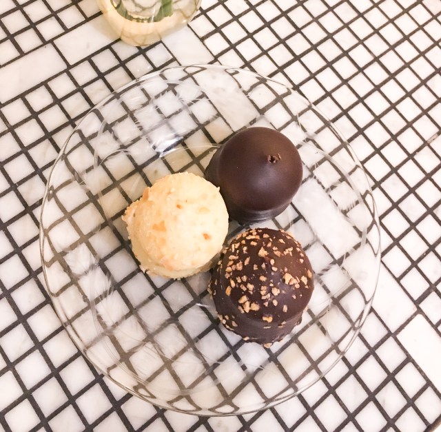
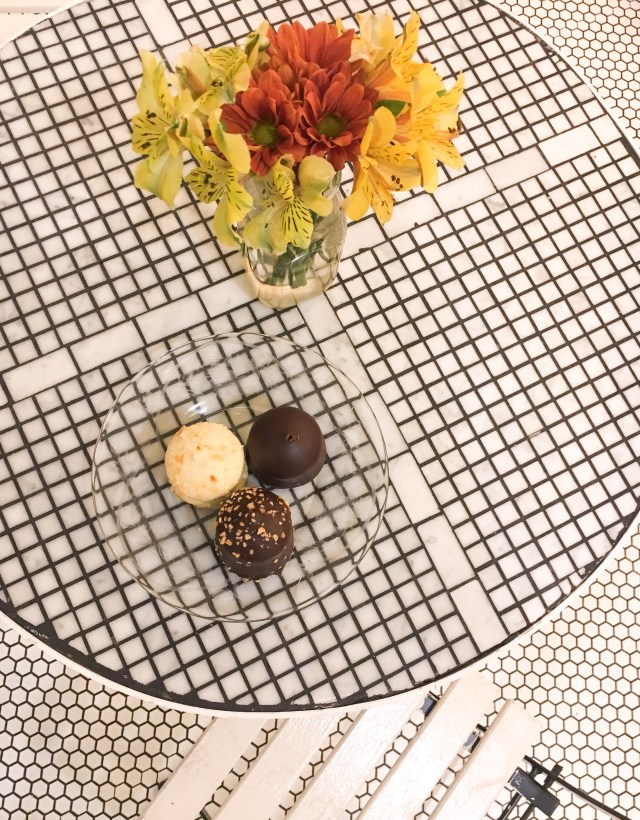
Once inside, what stood out to me the most was how beautifully delicate yet calming the layout was. The big cooling refrigerator case of macaroons were lined up with multicolored cookies and on top were cakes of different flavors. The back walls listed the menu in chalk, as well as positive messages on other walls also written in chalk. Everything available looked appetizing and minimal decor was inspirational.

I could envision myself leisurely catching up on my reading while sipping a cup of cocoa on a cold winter day, if I lived close by that is. I was mesmerized & enjoyed those extra lingering minutes just sitting on that white painted chair after we had finished our melted marshmallow chocolate dipped desert.


instagram | twitter | youtube |

The Fashion Portfolio

This was it, the sum of all my classes and lessons of the fashion design associates degree program. From draping classes, to pattern making and figure drawing sessions with nude models. By the time I got to this stage in the program, I was wiped out and had mentally checked out from designing. I was more eager to finish, rather than embracing and learning from the challenging process. I had no vision as to how I was going to turn my whole experience into a career and questioned if I wanted to pursue this for the rest of my life.

But this summer, I decided to take up the challenge to redo my fashion design portfolio. Deep down, I have a desire to figure out a way to turn my skills into a career. I took the summer to reflect on all the lessons that I had learned while in the degree program and started to develop a more positive perspective compared to when I was still in it. School is just one of those experiences where I don’t know how good it is until it’s gone.

Over the summer, I jumped into the process of designing again and this time I followed my own instincts as to what feels right. I’ve changed my idea behind my portfolio by actually thinking of a customer, a women who would be drawn to my looks. I’ve changed the layout of how it’s presented by emphasizing the small details compared to the previous layout. Nothing was left by accident, everything is purposeful because one day soon I’m going to have to explain my thought process of what I’m displaying. The last thing I want to feel is embarrassed for what I am showing.

I’m still spending time making changes and adding more details to every look. I’m not half way done yet but when it is, the sense of accomplishment will make my guilt go away… hopefully lol

IMG_3717-2

IMG_3720-2

IMG_3716-2

IMG_3723-2

#OOTD x Hot Pink Ombre Nike Sneakers

ombre8

ombre5

ombre1

ombre4

ombre2

ombre7

ombre6

This is a casual Friday street wear workout sporty outfit. The best part about it are my favorite throwback ombre hot pink and purple Nike sneakers because their so eye catching and comfortable. It instantly adds life to any occasion and emotionally, it brightens my mood!

Since my body is still bouncing back from my pregnancy, I’ve been wearing a lot of black on a day to day basis which sucks. Wearing black is very slimming but it makes you feel hotter and with the NYC humidity, your like a walking sauna which is not cool. But I won’t get tired of wearing my Straight Outta Compton t-shirt because its perfectly oversized to wear as a mini dress or tie it in the center to add more shape. I thought it be relevant to wear because of the release of the Tupac movie All Eyez On Me, which I can’t wait to go see this weekend! Even though its kind of a throwback fad to the summer of 2015 when these shirts were everywhere with the release of the movie.

I hope you’ve enjoying this dose of minimal and sporty inspo #ootd. Let me know in the comments below if you like this outfit/or the sneakers. Also, which movies have you seen in theaters lately? Are you excited to see the Tupac movie? Was he your favorite 90’s artist?

Like always, have a blessed day!

outfit: ombre roshe run Nike | t-shirt Unknown | running shorts Champion | choker Customized

Socials: instagram @rozalyndamoxie | snapchat @rozalyndamoxie

Sally Hanson x Romantic Gold Nails

p2


I’m having a very golden moment as the summer in NYC is just getting started, borderline obsessive. The most attractive part is the subdued luxe look and that hint of shine that’ll instantly grab your attention once the light hits it just right. We’re constantly using our hands, they might as well be eye catching. NYC is bound for more sun and heat in the next few months and metallic makes for a beautifully bold hue to embrace the rays we’ve lost all winter long.

I picked up the Sally Hanson Insta-Dri Go For Gold nail polish because I was inspired and it was under $5. Honestly, I had some doubts on the quality because of the price tag. But as I was testing it out, I started to really love the consistency and the color. I created minimal design which really showed me how consistent the formula truly was. I was very excited with the outcome of the design when it was all dry!

p3

I hope that you’ll use the design as a source of inspiration for your own nail design masterpiece. Not everything has to look perfect because beauty comes in so many different ways.

Ps. Since I’m not one to buy a lot of nail polishes, I like to reuse the ones I already have until very last drop! This whole month I’m planning to re-imagine new designs using this gold polish (and others I have in my arsenal) I CANT WAIT TO SHOW YOU!

Thanks for reading along and checking out my blog.

Have a blessed day!


Lust’n For Sally LaPointe Pre-Fall 2017

overview

Favorite looks from the collection

The first time Sally LaPointe was brought to my attention was when the fashion and lifestyle influencer, Daniella of @weworewhat, posted up a deliciously elegant metallic motto leather jacket on her Instagram for a little #fashioninspo. As I decided to skim through Sally LePointes Pre-Fall 2017 collection, which hits stores in June, I noticed a range of styles from simple polished silhouettes to sporty with a touch of athleisure without going over board (hello #minimalism lol). Most of her pieces have trims of fox fur from Finland, albeit, I’m pro faux fur but my goodness, does it look so luxurious as it juxtaposes the easy and comfort of a boxy silk cashmere hoodie.

It immediately answered my need and desire for items that look one of a kind with elements of luxuriousness and casualness, finding this balance could be really tricky, especially with the abundance of designers in the fashion industry. As I was reading through an interview the designer did for Fashionista.com, she describes her line as being “Powerfully feminine. Tough and elegant — again kind of that fine line thing.”

Yes, yes, yes & I couldn’t agree more. Here are some of my favorite complete looks from her collection for Pre-Fall 2017 that I’m currently lusting over. Also, some key pieces that I would love to rework with other items for a cool #ootd for a Brooklyn gal. She’s one designer who I’ll be definitely looking towards as a source of  fashion inspiration for the exciting new year ahead because of her unparalleled eye for design and I hope you will too!

#ootd for Sunday brunch!

#ootd for Sunday brunch!

#ootd for School!

#ootd for School!

look-one

#ootd for Work!


Thank you for reading along && let me know what you think about the collection in the comments below. Have a blessed day & Happy New Year lovelies!

Harum x Scarum Nails!

When the going gets tough, just change your route! lol

That was my philosophy as I was thinking about the different things I could do for my minimalistic style nails update. The first idea I had was a complete bust with wasted supplies and time because I originally had no inspiration. It looked awful, messy and thick. Undeniably, not runway/ instagram/ snapchat ready. But as I let my mind wonder, deep down, all I wanted was something effortless, chic and something I could look down at & fall in love with. After I was finished, I still felt very creative and added a very festive design detail on my skin (something I’ve never tried before but will be doing  a lot more in the future).

The idea was to be intentionally messy, sort of like a work of art.

Hope you all enjoy & let me know what you think in the comments below!

halloween-5

halloween-4

halloween-3

halloween-2

Potters Clay Color Block

block3

block

block1

img_0298

For this nail design update, I really wanted to incorporate a autumn feel by using this clayish shade. When I saw the color, it instantly reminded me of one of the many Pantone colors for Fall 2016 that I wrote a post about a few weeks ago, which called the color Potters Clay for the russet orange undertone. This one in particular is called Brick House by Deborah Lippman lacquer. My favorite part about the Deborah Lippman lacquer is that it retains an impeccable shine without having to add layers of shine coating to finish it. Using the instagram image as inspiration, I colored blocked the Brick House with the pale white by Wet n Wild called Break The Ice, to represent the changing season! Nothing like a high and low mix to create something amazing. I hope you enjoy & let me know what you think of this design in the comments below!

#OOTD x Streetwear: Wednesday

main

grey

full

details

china

Lately, I’ve been wearing a lot more hats and I’ve come to realize that it has so much versatility from hiding bad hair days, uplifting any outfit & instantly creating a more casual, easy going feel mood. The color of the hat is anywhere from grey to light blue (?) I can’t really tell but because its one of those random light colors, it blended really nicely with the different tones of my wardrobe. My take for streetwear is comfort (life’s already tough enough) but also attractive. Now that its the beginning of the fall season, I’m ready for more layers, especially with sweaters. NYC’s cold for seventy-five percent of the year and I know I can’t have enough outerwear. Hope you liked the look (and the local street cat that kind of reminds me of batman)!

Forever 21; outer jacket, inner shirt | Target; sweater | Keds; shorts | Joe Fresh; bag |Claires;  accessories

Pantone: Fall 2016 Fashion Report!

It’s that time of year again where all the top fashion editors, influencers and elite are preparing themselves for the crazy schedule that’ll be Fashion week. The month long journey of the Spring 2017 collections beginning in New York City and traveling through the major fashion capitals of the world like; London, Paris & Milan.

Albeit the media will be all over what the runway shows will display for next season, currently I’m more interesting in what colors and hues and shades will emerge this Fall season until next year. Almost all summer I was wearing blacks or greys and now that the fall is here, undoubtedly, black will be one of the dominant colors throughout many new yorker’s closets and theres no better time then the change of a season.

Pantone, the authorities on color that provide color systems and leading technology for accurate communication of colors for a wide range of industries including the fashion, has available a list of colors that’ll be dominant throughout Fall 2016.

Below are the list of colors:

screen-shot-2016-09-06-at-4-28-09-pm

screen-shot-2016-09-06-at-4-28-30-pm

screen-shot-2016-09-06-at-4-28-50-pm

screen-shot-2016-09-06-at-4-29-08-pm

screen-shot-2016-09-06-at-4-29-28-pm

screen-shot-2016-09-06-at-4-29-49-pm

screen-shot-2016-09-06-at-4-31-07-pm

screen-shot-2016-09-06-at-4-31-39-pm

screen-shot-2016-09-06-at-4-31-55-pm

screen-shot-2016-09-06-at-4-34-35-pm

1ab9fc2a20026aeccf5aca36f5e9c45d

My personal favorites are the Potters Clay, Dusty Cedar, Warm Taupe, Sharkskin and Airy Blue. Let me know in the comments which colors are your favorite. Thanks for reading!


references:
Featured Image Ilustration from Rubin Singer
http://www.pantone.com/fashion-color-report-fall-2016?from=hpSlider#hero
http://www.refinery29.com/2016/02/102969/pantone-fall-2016-color-report#slide-14

Metallic Foil Stripe x Nails Update

IMG_9812

IMG_9817


IMG_9783

IMG_9804

IMG_9749

Before I decided to try this design, I wasn’t aware that the stripes are called nail foil and if your looking for the ultra thin ones, just add stripe to the end of that google search. Their not expensive but before I purchased it, I decided to experiment with supplies I already had available at home. To improvise, I used aluminum foil to cut into really thin stripes and for glue, I depended on the polish to get a little dry and tacky. The tackiness made it like glue which made the foil stripes stick with only a few layers of coating. Then lastly, sealed with a clear top coat…

These are the finished results! Enjoy and let me know what you think of this design!