Green or Emerald

Finally, little by little, I think I’m getting back to my creative self again. It’s difficult to manage creative thinking with the more logical and reasoning side. For some time now, I feel like I’ve lost that creative thinking side of me. My most recent college semester was really demanding and for the first time in my academic career, I didn’t take some sort of art or self expression coarse. Here’s what I mean, since high school I’ve had some sort of art class that forced me to constantly create something and therefore, I’ve consistently forced myself to think creatively. Reflecting back, it feels like a blessing and curse.

Its a blessing because I got a chance to change my routine, to try a different side of myself that I didn’t understand very much. But within my new degree, most of my classes consist of business courses. I’ve come to realize and compare how much more differently it forces you to think, yet creative courses can take you around the universe and back. Literally the sky’s the limit on your imagination. But taking mostly business coarse’s is a curse because its like building a new muscle, building a new set of skills is tough the first go-around. Luckily the more frequently I use it, the more it becomes second nature and then it starts to feel like it is on autopilot. The only thing is, I’m not bombarded with the types of scenario’s studied in class to consistently practice what I’ve been learning. A skill truly develops once its practiced frequently, but how do I get there without being forced to utilize it?

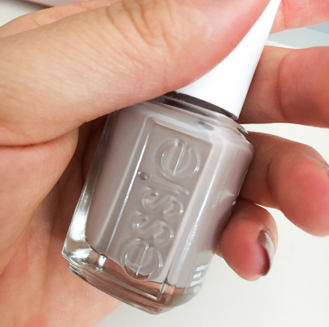
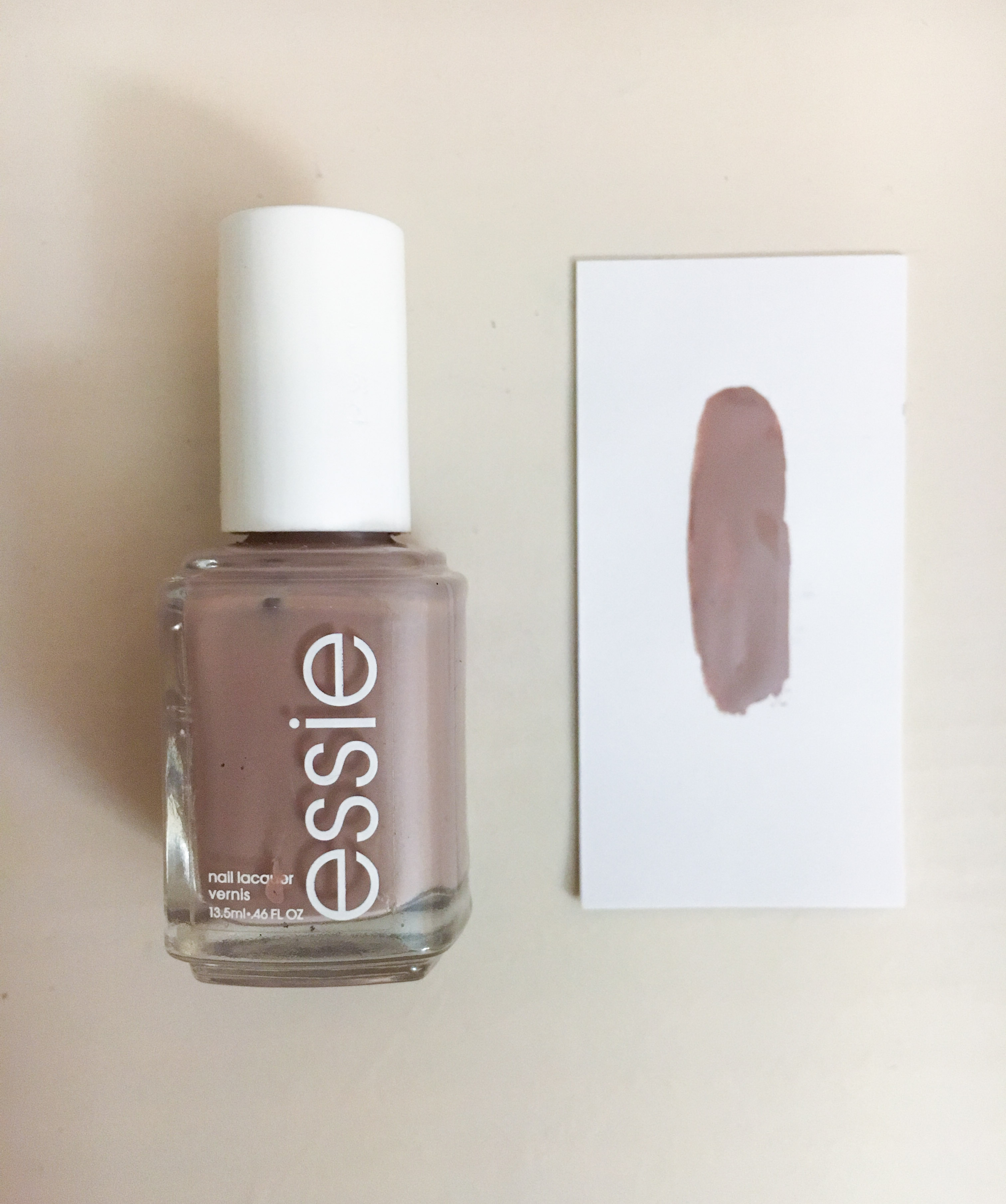
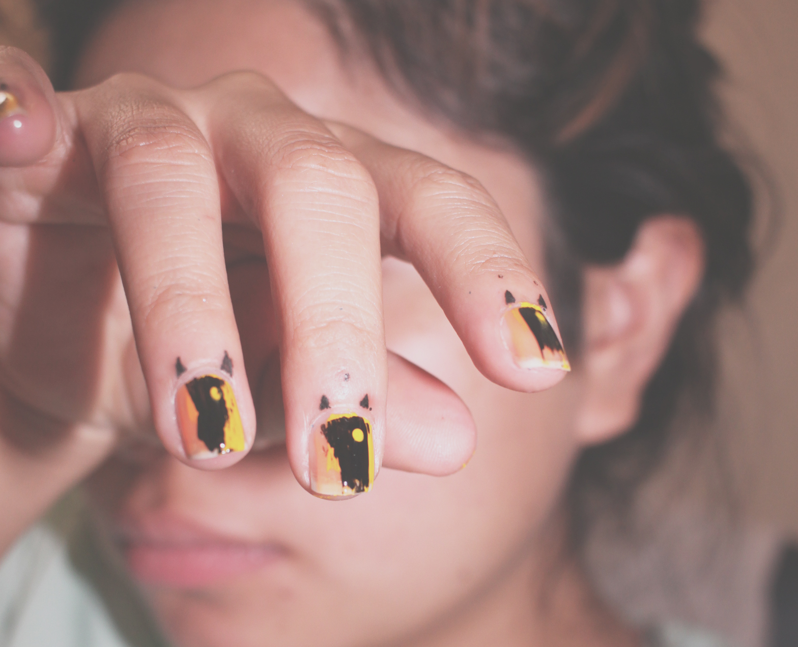
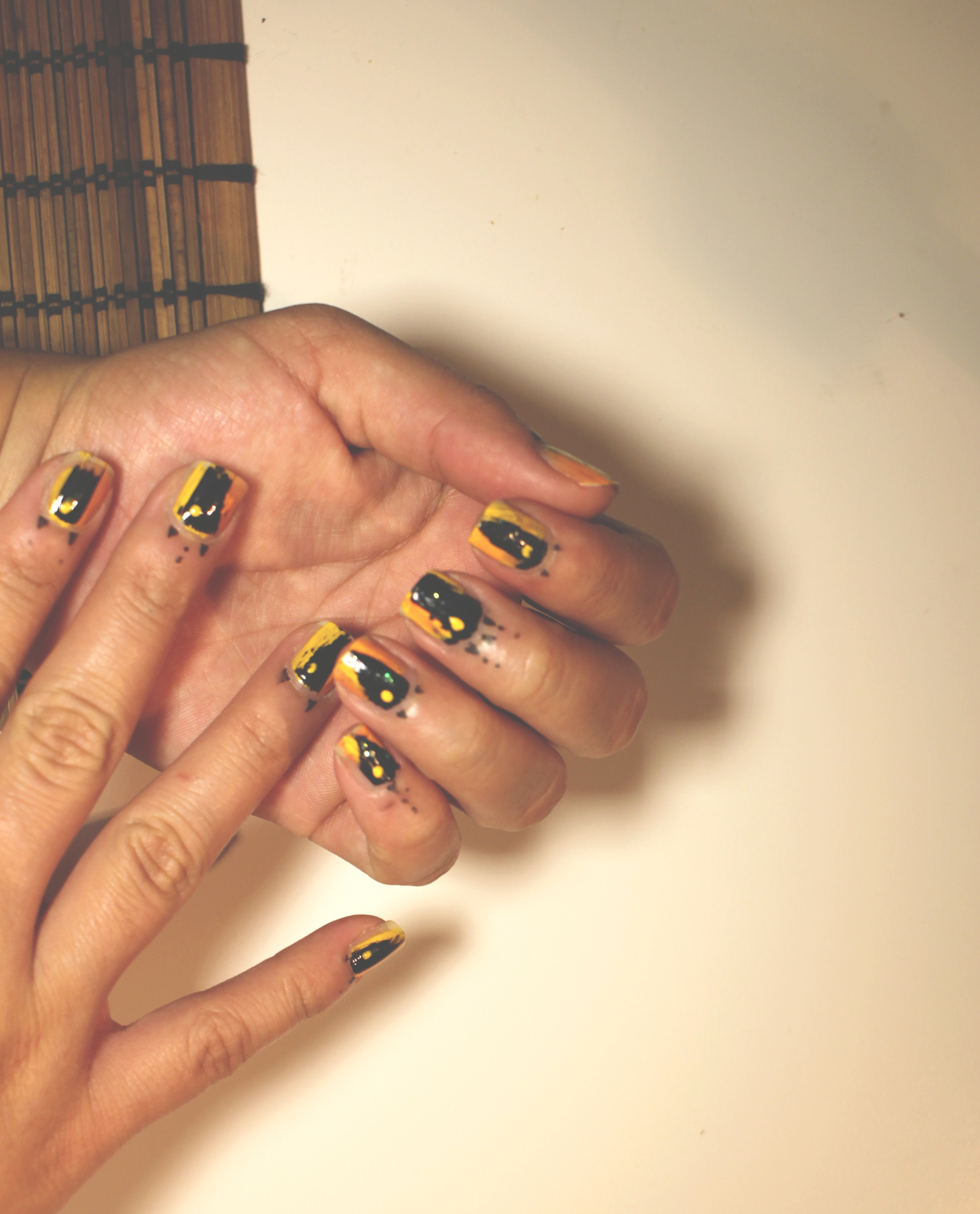
Here’s a picture of my new nail polish, my logical side would call this green and if I’m being political, then I would say dark green. But I can also call this color emerald. Emerald, a quick google search describes it as the color that encourages growth, reflection, peace and balance. Apparently, the verdant tones reflected in the jewel are tempered by a cool blue that symbolizes a steadfast bond. Isn’t that description beautiful and coincidently describes this post perfectly.

Essie ‘Wild Nude’ x Nail Update

essie-2

essie-6

essie-3

essie-5

essie

I mean, can we talk about this color?

its pretty but is it brown or like a medium tone grey?

I purchased this nail polish a few days before my wedding because of how sophisticated the hue looked. I wanted to make sure my nails looked polished as we exchanged our vows and slide the marriage bands onto our fingers.

I hope you enjoy the little nail polish inspiration for the day!

Sally Hanson x Romantic Gold Nails

p2


I’m having a very golden moment as the summer in NYC is just getting started, borderline obsessive. The most attractive part is the subdued luxe look and that hint of shine that’ll instantly grab your attention once the light hits it just right. We’re constantly using our handsthey might as well be eye catching. NYC is bound for more sun and heat in the next few months and metallic makes for a beautifully bold hue to embrace the rays we’ve lost all winter long.

I picked up the Sally Hanson Insta-Dri Go For Gold nail polish because I was inspired and it was under $5. Honestly, I had some doubts on the quality because of the price tag. But as I was testing it out, I started to really love the consistency and the color. I created minimal design which really showed me how consistent the formula truly was. I was very excited with the outcome of the design when it was all dry!

p3

I hope that you’ll use the design as a source of inspiration for your own nail design masterpiece. Not everything has to look perfect because beauty comes in so many different ways.

Ps. Since I’m not one to buy a lot of nail polishes, I like to reuse the ones I already have until very last drop! This whole month I’m planning to re-imagine new designs using this gold polish (and others I have in my arsenal) I CANT WAIT TO SHOW YOU!

Thanks for reading along and checking out my blog.

Have a blessed day!


Harum x Scarum Nails!

When the going gets tough, just change your route! lol

That was my philosophy as I was thinking about the different things I could do for my minimalistic style nails update. The first idea I had was a complete bust with wasted supplies and time because I originally had no inspiration. It looked awful, messy and thick. Undeniably, not runway/ instagram/ snapchat ready. But as I let my mind wonder, deep down, all I wanted was something effortless, chic and something I could look down at & fall in love with. After I was finished, I still felt very creative and added a very festive design detail on my skin (something I’ve never tried before but will be doing  a lot more in the future).

The idea was to be intentionally messy, sort of like a work of art.

Hope you all enjoy & let me know what you think in the comments below!

halloween-5

halloween-4

halloween-3

halloween-2

Potters Clay Color Block

block3

block

block1

img_0298

For this nail design update, I really wanted to incorporate a autumn feel by using this clayish shade. When I saw the color, it instantly reminded me of one of the many Pantone colors for Fall 2016 that I wrote a post about a few weeks ago, which called the color Potters Clay for the russet orange undertone. This one in particular is called Brick House by Deborah Lippman lacquer. My favorite part about the Deborah Lippman lacquer is that it retains an impeccable shine without having to add layers of shine coating to finish it. Using the instagram image as inspiration, I colored blocked the Brick House with the pale white by Wet n Wild called Break The Ice, to represent the changing season! Nothing like a high and low mix to create something amazing. I hope you enjoy & let me know what you think of this design in the comments below!

Metallic Foil Stripe x Nails Update

IMG_9812

IMG_9817


IMG_9783

IMG_9804

IMG_9749

Before I decided to try this design, I wasn’t aware that the stripes are called nail foil and if your looking for the ultra thin ones, just add stripe to the end of that google search. Their not expensive but before I purchased it, I decided to experiment with supplies I already had available at home. To improvise, I used aluminum foil to cut into really thin stripes and for glue, I depended on the polish to get a little dry and tacky. The tackiness made it like glue which made the foil stripes stick with only a few layers of coating. Then lastly, sealed with a clear top coat…

These are the finished results! Enjoy and let me know what you think of this design!


90’s Paint Splatter: Nails Update

IMAG3815-01

IMAG3820-01

boulders_jawbreakers_1

Did you notice? maybe? That the middle of the 2010’s brought out everyones inner 90s kid. Suddenly 90s throwbacks were blissful reminders of the simpler moments during our youth. People expressed their homage to that decade through their fashion and beauty choices. If this decades version of the 90’s sticks around for the remaining of the of 2010’s, only time will tell, but it’ll be a hell of an interesting sight to see how the styles evolve and grow with the different tastes. Heres my ode to 90’s trend, a jawbreaker paint splatter style nails. Using some warm water, hair spray, olive oil cooking spray, and a piece of plastic, I managed to get the style down but it took some patience.

Enjoy!